Heygo.com | Product
Go far. From home.
Designing the next generation of virtual travel experience.
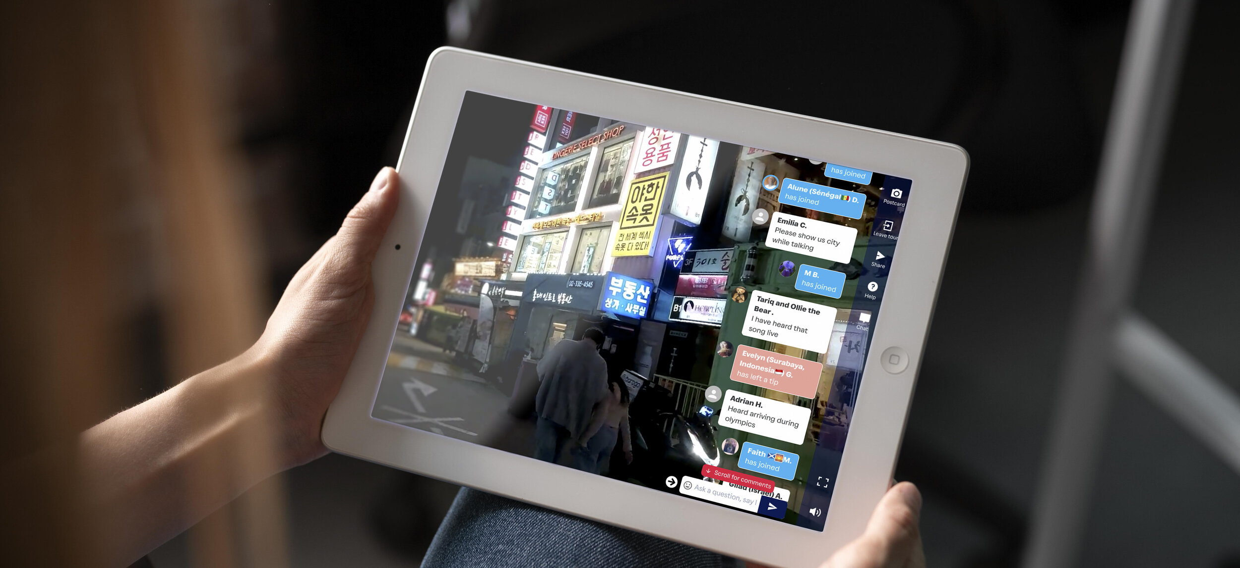
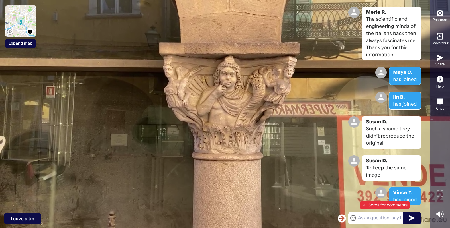
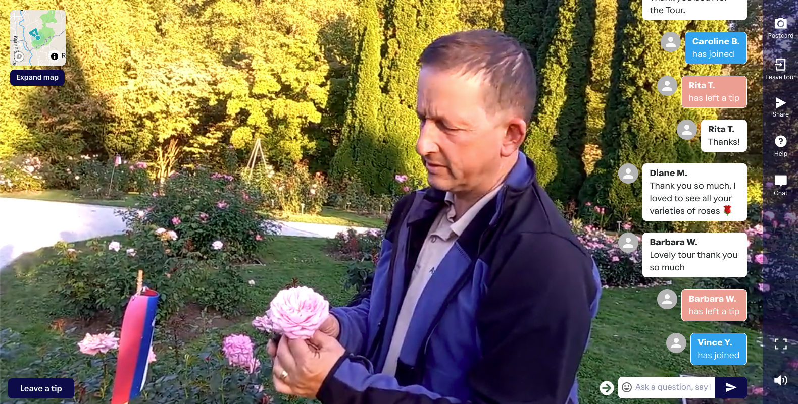
When COVID hit, the world ground to a halt and many industries felt the effect - none more so than travel and tourism. However, in every crisis there’s opportunity and for a small UK start-up offering world-wide virtual city tours, the opportunity was suddenly global. Heygo had us exactly where they wanted us - on the sofa.
Although ‘Virtual Tours’ weren’t a new concept, the fact that they were 'tip-supported’ was a completely new initiative and had users booking tours by the bus-load.

The Goal
With a basic, but functioning product, high-profile investors and a feature roadmap longer than The Nile, the goal was twofold - increase booking numbers and increase the number of unique tours offered by guides on the platform (as quickly as possible).
Feature Developments
I worked on three major feature developments during my time at Heygo:
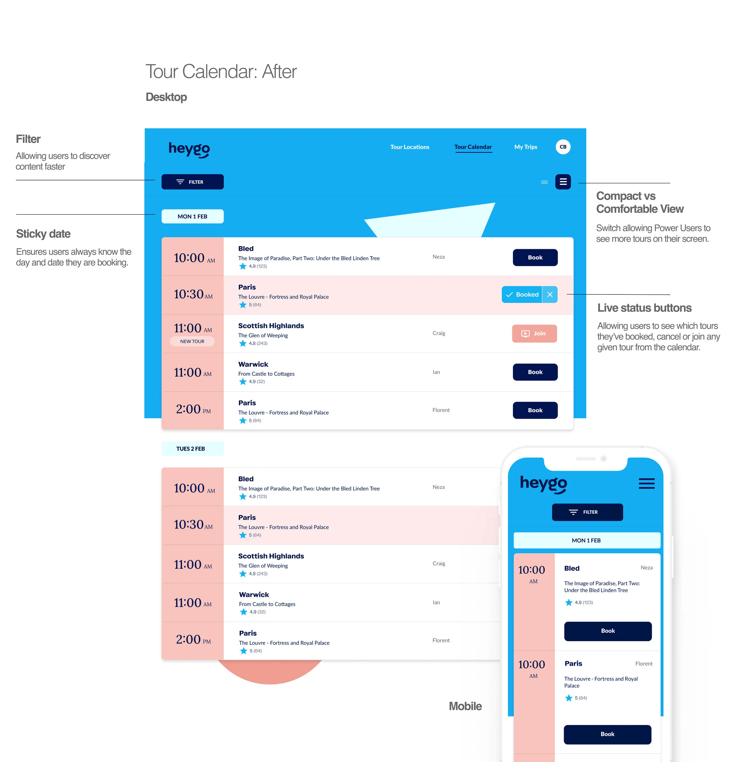
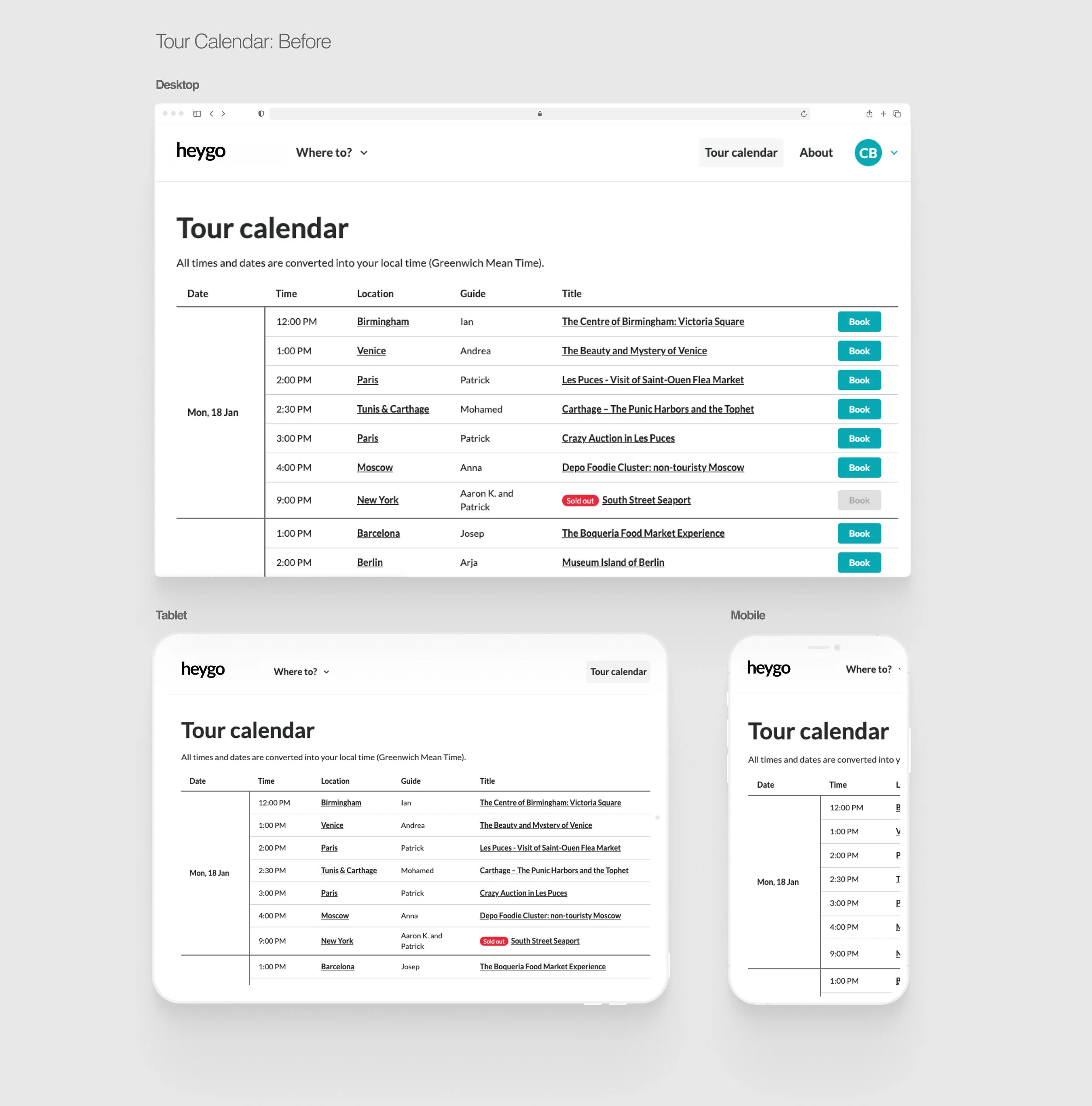
Tour Calendar - by far the most popular page of the site, users would use the calendar to browse, book and cancel upcoming tours.
Tour Review Process - important to understand how the platform and guides were performing, so they continue to focus on what worked.
Postcards - helping users collate, annotate and share their postcards, creating virality and increasing new user numbers.
The largest of these, the Tour Calendar ticket is explored below.


The Problem
The business had the following issues:
The Customer Care team were overrun by requests to cancel a tour place if and when a user decided they could no longer attend. There was a button that allowed the user to do this, however it was very well hidden in another part of the site.
The Customer Care team were overrun by users asking how they joined a tour once booked. A confirmation email was sent to the user which included a joining button, but this could be days or a week in advance and would be lost or deleted.
The existing calendar was not responsive. It had been designed for Desktop which caused some extreme user behaviours, observed via Hotjar.
Users would book multiple tours at once, booking so many that they would forget what they booked and when, causing them to miss tours and the business to lose revenue.
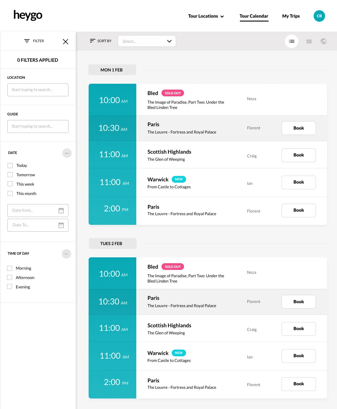
Users could not filter the list of tours by any means.

Research
Research was undertaken with user types in order to validate feature developments both before embarking on design briefs and after initial prototypes had been created.
Face to face Zoom calls - existing users in the UK and US were interviewed for their opinions on the current calendar, what was good/what needed improving while aligning these conversations with business requirements.
Anonymous surveys - were posted on the very active Facebook group in order to gain insight into current habits/user perecptions and requirements.
Hotjar - used to understand actual usage patterns, identify issues and areas for improvement.
Prototyping
Once flows were agreed, prototypes were developed in Figma, shared with internal stakeholders and then tested with existing users and non-users. Valid feedback was discussed and developed in the final concept.
Prototype 1
Prototype 2

Outcome
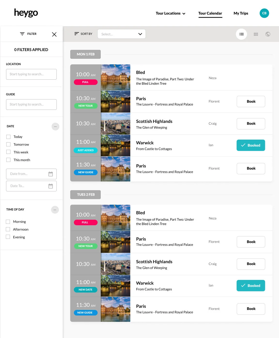
The business issues were resolved by updating the following to the calendar:
The calendar’s design was made responsive, allowing it’s large mobile and tablet audience a much improved booking experience.
A live status button was introduced to the calendar which indicated which tours had been booked, allowed the user to cancel a tour or join when available. This was a simple addition to the design, but a game-changer for the business.
A sticky date was added to the calendar, allowing users to clearly see the date in question.
A filter was added to the calendar.